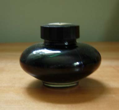
If you've never heard of Namiki before, neither had I. Check out their website, though, and you will see some beautiful fountain pens. It seems a requirement that if you make fountain pens you make ink, though the reverse is not true. I had to keep the box this ink came in because there is no print on the bottle at all. It is just a simple elegant black bottle. The bottle is typically modern in styling, and dare I say has a Japanese look and feel to it. This is art.
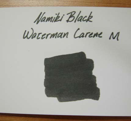
This is the sixth black ink I have tried, and at this point I'm starting to no longer know what black really is. Noodlers Bulletproof Black stills comes in as the champion for being the blackest in color. Namiki is in the middle of the pack, being darker than J Herbin and Mont Blanc, but lighter than Waterman, Sailor and Noodlers. Darkness of color is only one dimension here.

The color reminds me very much of Balachulish slate, which if you haven't been to the highlands of Scotland means nothing to you. Think a very dark putty color. I put this ink in my Waterman Carene pen. This pen is absolutely beautiful and has the lines of a racing yacht. I would use it more often but the nib is a medium and has the distinction of drawing the broadest line in my collection. Funny right? This is to say that my doodling with it and making of the sample card really showed the ink off to its best. The color is highly saturated and it flows easily from the pen. I will also admit here that I find the color very much appealing. Yes it is black, but there is just enough gray in it to make you stand up and notice. Rather than a bright and vivid black this has the look of a black that the sun and a bit of time have faded. This appeals to me.
I like this ink. It is a definite keeper; it's very close to perfection for Chas.

The Piker Press moderates all comments.
Click here for the commenting policy.